
Why Your Hotel’s PPC Campaign Is Leaking Money (And How to Fix It)
Ever had that weird feeling that your ads are working… but your bookings are not? You’re not alone. A lot of hotels spend good money on PPC for hotel bookings, get clicks from Google Ads, and still see weak direct booking results. That hurts. Fast.
Here’s the thing. The ad is only the first step. The real moment of truth happens on the landing page, where a curious click turns into a guest who trusts you enough to book. If that page feels slow, fuzzy, or just plain hard to use, people leave. And they leave quickly.
That is why hotel landing page optimization matters so much. It’s not just about pretty photos or a shiny offer. It’s about making the path from ad to booking feel smooth, clear, and worth it. Google says landing page experience plays a part in Quality Score, right next to ad relevance and expected CTR, so a better page can help your ad costs, too Google Ads Quality Score guide.
And honestly, this is where hotels can start taking back revenue from OTAs. Better pages can help increase hotel direct bookings, cut wasted spend, and lower your cost per booking. That means less money leaking out through commissions and more control over your guest relationship.
Think of this guide as your simple playbook for hotel PPC campaign strategy. We’ll look at what makes a hotel ad landing page work, where travelers get stuck, and how to build a direct booking path that feels easier than booking anywhere else. Because if your site can beat the OTA experience, you’ve got a real shot at keeping that revenue in-house.

1. The Anatomy of a High-Converting Hotel Landing Page
You know that tiny pause before someone books? That little moment matters a lot. A traveler clicks your ad, lands on your page, and makes a split-second call: stay or leave. If the page feels off, they’re gone. Just like that.
A strong hotel landing page should match the ad right away. If your Google Ads for hotels promise a winter deal, the headline on the page should say the same thing. No weird detour. No generic homepage that makes people hunt for the offer. Google says landing page experience is one of the three parts of Quality Score, so message match can help your ad costs too Google Ads Quality Score guide. That’s a nice little bonus, honestly.
What belongs above the fold?
This part has to work fast. On mobile, even faster.
- Headline that mirrors the ad: Use the same offer or promise your ad teased.
- Hero image or short video: Show the room, view, pool, or breakfast spread. Real is better than glossy nonsense.
- Clear CTA: Put Check Availability & Rates where eyes land first.
And keep the CTA easy to tap. Big button. Clean color. No hiding it under four other things like it’s a secret.
What should sit below it?
After the first screen, travelers want proof. They want to know what they’re getting, where the hotel is, and if other guests liked it.
A good layout usually includes:
| Page Element | Why It Helps |
|---|---|
| Amenity icons | Lets guests scan fast |
| Photo gallery | Shows rooms, beds, bathrooms, and views |
| Guest reviews and ratings | Builds trust before booking |
| Map and location section | Answers the big “where is this?” question |
Baymard’s travel UX research points to the same pain points again and again: hidden search boxes, missing maps, weak property details, and clunky filters all push people away Baymard travel UX best practices. Weirdly enough, the fix is often pretty simple. Make things visible. Make things obvious.
And don’t skip social proof. Most travelers read reviews before booking, so a few review snippets near the booking engine can calm nerves fast. That tiny bit of reassurance can help increase hotel direct bookings and improve your booking engine conversion rate.
Mobile-first is not optional
Here’s the deal. Most hotel traffic now starts on mobile. D-EDGE reports that mobile drives about 70% to 80% of hotel website traffic, even though desktop still often wins on final bookings D-EDGE Hotel Distribution Report 2024. So your hotel landing page has to feel smooth on a small screen. No squinting. No pinching. No endless forms.
If your page loads slowly or the CTA gets buried, you’re basically asking guests to leave. And they will.
This is also where tools like Ease My Hotel can help behind the scenes. A clean booking flow, solid guest communication, and a unified dashboard can make the whole direct booking path feel less messy for your team and your guests. Less back-and-forth. Fewer dropped leads.
If you want better OTA vs direct booking PPC results, start here. Fix the page. Make the offer clear. Put the booking action front and center. Then test, tweak, and keep it simple.

2. Achieving Perfect Message Match: The Key to Higher Quality Scores & Trust
Ever clicked an ad because the offer sounded great, then landed on a page that felt like it was talking about something else? Annoying, right. Travelers notice that stuff fast.
That gap is called message match. It means your ad copy and your landing page say the same thing in a clear way. Same offer. Same promise. Same vibe. If your ad says 20% off winter special, the page should say 20% off winter special too, not just toss people onto a generic homepage and hope they figure it out.
And here’s why this matters so much for ppc for hotel bookings. Google’s Quality Score looks at three things: expected CTR, ad relevance, and landing page experience. That last part is where message match lives. Strong match helps the page feel useful to the guest, which can lower CPCs and help ad position, so you can reduce hotel CPA without tossing more money into ads Google Ads Quality Score guide.
Think of it like this. If someone searched for a beach escape in Miami, they do not want a random room page with no mention of the deal they clicked. They want to see the exact room, exact perk, and exact offer they expected. No guesswork. No hunting.
What message match looks like in real life
Here’s the simple rule: the ad starts the story, and the landing page finishes it.
| Ad Promise | Landing Page Fix |
|---|---|
| “20% off winter special” | Headline says the same deal right away |
| “Free breakfast and parking” | Those perks appear near the top |
| “Book direct for best rate” | The booking page repeats that message clearly |
| “Spa weekend in Austin” | Photos and copy show the spa package, not a generic stay |
If the offer changes between the ad and the page, trust drops. Fast. And trust is a big deal in hotel PPC campaign strategy because travelers are already comparing you with OTAs, maps, and a dozen other tabs on their phone.
Why this helps more than just clicks
Good message match can also improve your booking engine conversion rate. Why? Because people feel like they’re in the right place. They’re less likely to bounce, less likely to second-guess, and more likely to finish the booking.
Travel ads can already do pretty well. Google Ads benchmarks for travel and hospitality often show CTR around 4.68% to 5.36% and CVR around 3.55% to 4.68%, so there’s room to win if your page keeps the promise Google Ads travel benchmarks. But if your landing page breaks that flow, you lose momentum. And momentum matters.
Honestly, this is one of the easiest ways to improve hotel landing page optimization. Not by making the page louder. Just by making it line up.
Common hotel PPC message match mistakes
A few mess-ups show up a lot:
- Sending paid traffic to the homepage instead of the offer page
- Using ad copy that says one deal, while the page talks about another
- Hiding the booking CTA below too much content
- Forgetting to repeat the target location or room type
- Making mobile users pinch and zoom just to find the price
But wait, there’s a better way. Build the landing page around one clear reason to book. One page. One offer. One next step.
And if you’re trying to increase hotel direct bookings, this is where the OTA vs direct booking PPC fight gets interesting. Direct bookings keep more profit in your pocket because you’re not handing over 15% to 25% in commissions to a third-party site. That alone makes message match worth your time, because every cleaner click has a better shot at turning into revenue.
A good test: read your ad out loud, then read your landing page headline out loud. If they do not sound like twins, fix it. Simple stuff. But it works.
3. Persuasive Copy & Visuals: Selling the Experience, Not Just the Room
You know what sells a hotel room? Not a line that says “Queen bed, 300 sq ft.” That’s just data. People book a feeling. A break. A better night’s sleep. Maybe a little bragging right for their group chat too.
So your hotel landing page needs to show the stay, not just list it. Strong photos matter a ton here. Crisp room shots. Bright bathroom photos. Real pool views. A quick video tour helps even more, because guests can picture themselves there. And once they can picture it, booking feels a lot easier.
A few travel sources say video can lift conversion rates by up to 80%, and many travelers say video changes their booking choice. That lines up with what we all do, honestly. We scroll, we skim, and we trust our eyes first.
What great visuals should do
- Show the room size in a real way
- Give a feel for the mood and style
- Prove the view, pool, breakfast, or spa is real
- Help mobile users decide fast without reading forever
A photo gallery should not feel like a random folder. It should guide the guest. Start with the best room. Then the view. Then the parts that solve a need. Think work desk, blackout curtains, parking, or a quiet corner for a last-minute call.
Write copy that talks benefits
This part is where a lot of hotel PPC for hotel bookings pages go flat. They list features. Guests care about results.
| Weak Copy | Better Copy |
|---|---|
| Queen bed, 300 sq ft | Unwind in a spacious room made for deep rest |
| Free WiFi | Stay connected for work, streaming, or planning your day |
| Airport shuttle | Skip the taxi stress with a free ride to and from the airport |
| Pet-friendly room | Bring your travel buddy along without the hassle |
See the shift? One version gives facts. The other gives relief.
And relief sells. Especially on a busy booking page.
The little details that calm nerves
Guests scan for answers fast. So list the stuff that solves problems right away:
- Free high-speed WiFi for remote work
- Pet-friendly rooms for travelers with pets
- Complimentary airport shuttle for late arrivals
- Breakfast included for easy mornings
- Free parking for road trips and family stays
A lot of travelers also read reviews before booking. Baymard’s travel UX research shows that maps, strong property details, and third-party reviews are often missing or hard to find, which makes people drop off Baymard travel UX best practices. So if your page has a nice review widget near the CTA, use it. That small trust boost can help your booking engine conversion rate without making the page feel crowded.
And don’t forget the mobile view. Most hotel traffic starts on phones, so your images and copy need to load fast and read cleanly. No tiny text. No giant photo that pushes the book button off-screen. Please, not that.
If you want to improve hotel landing page optimization, this is a strong place to start. Pair sharp visuals with plain, warm copy. Then back it up with clear amenities and a clean booking flow. That’s how you reduce hotel CPA and make direct booking feel like the easy choice.
Tools like Ease My Hotel can help on the back end too, since a clean booking system and unified guest communication make it easier to keep that promise after the click. Because the page gets them in the door. The experience keeps them there.

Try Ease My Hotel for free.
No lock-in contracts. Cancel anytime
4. Streamlining the Booking Engine for Maximum Conversions
You know that awful moment when a guest is this close to booking, then bails because the form feels like homework? Yeah. That’s where a lot of hotel PPC for hotel bookings money slips away.
The booking engine should feel calm and quick. Not crowded. Not fussy. If someone has already clicked your ad, they’re ready to move. Don’t make them type their life story just to reserve a room.
Cut the friction, field by field
Keep the form short. Really short.
Ask only for what you need right now. Name. Email. Dates. Payment. That’s usually enough to start. Baymard’s travel UX research says booking flows work better when they stay linear, mobile-friendly, and low on extra steps, while too many fields and clunky checkouts push people away Baymard travel UX best practices.
A few fixes help fast:
- Use a clear step-by-step flow
- Add a progress bar so guests know where they are
- Group related fields together
- Don’t ask the same thing twice
- Keep the reserve button easy to see
Simple beats fancy here. Every time.
Show the full price early
Hidden fees are a mood killer. And in travel, people hate surprise costs more than they hate tiny airplane pretzels.
Show the total upfront. Room rate, taxes, and fees. All of it. If the price jumps near the end, guests often leave and never come back. That hurts your booking engine conversion rate and makes it harder to increase hotel direct bookings.
A clean price box near the top works well:
| Price Detail | What to Show |
|---|---|
| Room rate | Nightly price |
| Taxes | Local and lodging taxes |
| Fees | Resort, service, or cleaning fees |
| Total | Final amount before payment |
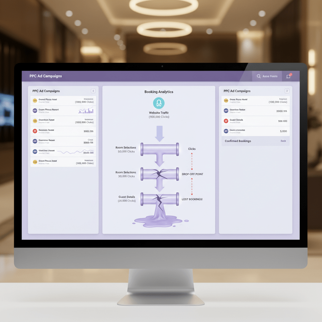
That one move builds trust fast. And trust matters because booking engines often lose 80% to 85% of visitors before checkout is done, according to hotel booking abandonment research Phocuswire on booking abandonment.
Offer payment options people actually use
Now, payment. This part gets ignored too often.
Guests want choices. Major credit cards are a must. But also add PayPal, Apple Pay, and Google Pay if you can. Those options feel fast and familiar, especially on mobile, where most hotel traffic starts. D-EDGE’s 2024 report says mobile drives about 70% to 80% of hotel website traffic, so the payment step should work well on a phone thumb, not just a laptop mouse D-EDGE Hotel Distribution Report 2024.
Also, put trust signs near the payment box:
- SSL lock or secure payment badge
- Visa, Mastercard, PayPal, Apple Pay, and Google Pay logos
- Clear cancellation policy
- Short note about secure checkout
That tiny bit of reassurance can calm people down. And calm people book.
Why this matters for hotel PPC campaign strategy
Your ad may bring the click, but the booking engine closes the sale. If the engine feels slow or sketchy, all that ad spend leaks away. That’s how hotels end up paying more than they should to reduce hotel CPA, while direct bookings stay stuck.
A smoother booking path helps with OTA vs direct booking PPC too. OTAs are handy, sure, but they take a cut. Direct bookings keep more profit in-house, so every completed reservation matters more.
And if your hotel uses Ease My Hotel, this is where the back end gets a lot easier. A unified dashboard, cleaner booking management, and guest communication in one place can help your team keep pace once the booking comes through. Less chaos. Fewer dropped leads.
So here’s the short version. Make the booking engine short. Make the price honest. Give people payment choices they trust. That’s how you get more finished bookings instead of half-finished clicks.

5. Building Unshakeable Trust and Urgency to Drive Action
Ever notice how fast you click away when a booking page feels sketchy? Same. Guests do it too. And in hotel PPC for hotel bookings, that tiny feeling can cost real money.
The fix is pretty simple. Put trust front and center. Right next to the CTA. Right near the payment form. No hunting. No guessing.
Use social proof where people can see it
Most travelers read reviews before they book. A lot of them read more than one, too. So don’t hide your good stuff on some far-off testimonial page nobody visits. Pull in recent Google or TripAdvisor reviews and place them near your main booking button. Add awards, badges, or a “Guest Favorite” note if you’ve earned it. Real proof helps people feel safe enough to keep going TrustYou review data.
A small review block can do a lot:
- 4.7-star rating from 312 reviews
- “Loved the breakfast and the view”
- Recent award for top guest satisfaction
- Short quote from a real stay
And keep it short. Nobody wants a wall of praise that reads like a school yearbook.
Use urgency, but keep it honest
Here’s the thing. Urgency works best when it’s real. If you only have 2 rooms left at that rate, say it. If a special offer ends at midnight, show the countdown. But don’t fake scarcity. People can smell that from a mile away.
Good urgency examples include:
- Only 2 rooms left at this rate
- Special offer ends in 03:12:18
- Book today for free breakfast
- Last room with a balcony view
That kind of nudge can help push a guest from “maybe later” to “book now.” Pretty handy when your booking engine conversion rate needs a lift.
Put trust signals near the CTA and payment box
This part matters a lot on mobile. D-EDGE says mobile drives about 70% to 80% of hotel website traffic, so guests are often booking with one thumb and not much patience D-EDGE Hotel Distribution Report 2024.
So place these close to the action:
| Trust Signal | Why It Helps |
|---|---|
| HTTPS lock icon | Shows the page is secure |
| Visa, Mastercard, PayPal, Apple Pay logos | Makes payment feel familiar |
| Clear privacy policy link | Reduces worry about personal data |
| Cancellation policy summary | Lowers fear of surprise rules |
The best booking pages don’t just ask for money. They earn it. That’s a big difference.
Why this helps your hotel PPC campaign strategy
Travel and hospitality search ads can perform well, with average CTR around 4.68% to 5.36% and CVR around 3.55% to 4.68% WordStream Google Ads benchmarks. But if your page feels cold, unclear, or risky, that click won’t turn into revenue.
So think of trust as part of your hotel landing page optimization, not just a nice extra. It helps reduce hotel CPA, supports OTA vs direct booking PPC goals, and makes guests feel better about booking direct.
If you’re using Ease My Hotel, this is where a clean booking flow and unified guest communication really help. The page brings them in. The system helps keep everything smooth after that. And when it all lines up? That’s where direct bookings start to feel a lot less fragile.
6. A Practical Guide to A/B Testing Your Hotel Landing Pages
You know that feeling when a page looks good, but bookings still feel stuck? Yeah. That’s usually the moment to stop guessing and start testing.
A/B testing is just a simple split test. You show one version of your hotel landing page to some visitors, and a second version to others. Then you see which one gets more bookings. Easy idea. Messy if you test too much at once.
So start with the parts that matter most:
- Headline: Try one version with a deal, and one with a stronger benefit.
- CTA button: Test the color and the text. “Check Availability” and “Book Direct” can behave very differently.
- Hero image: Try a room shot, then a pool, then maybe a short video clip.
Actually, wait. Don’t test five things at once. That gets confusing fast. Pick one change and let the numbers talk.
What to watch during each test
Track these three things for every hotel PPC for hotel bookings test:
| Metric | What It Tells You |
|---|---|
| Conversion Rate | How many visitors book |
| Bounce Rate | How many leave right away |
| Average Time on Page | How long they stick around |
If conversion rate goes up, great. But if bounce rate also jumps, that’s a red flag. Maybe the page promised one thing and delivered another. Or maybe the photo looked amazing but the offer was fuzzy. Happens all the time.
Keep the setup simple
A lot of people used to use Google Optimize, but that tool is gone now. So look at other options like VWO or Optimizely. Some booking engines also have built-in test tools, which is handy if you don’t want yet another login staring at you every morning.
Here’s the deal. The best test is the one you can run clearly. One change. One goal. One result. That’s how you improve hotel landing page optimization without turning your site into a science fair.
And if your team uses Ease My Hotel, a clean booking flow and unified dashboard can make testing easier too, since you’re not juggling a pile of separate systems. Less chaos. Better clues. More direct bookings.
From Clicks to Guests: Your Action Plan for Profitable PPC
So here’s the real takeaway. If your ppc for hotel bookings is bringing clicks but not guests, the leak is probably not the ad. It’s the page after the click.
The fix is pretty clear. Match the message. Show real photos and plain copy. Keep the booking flow short. Put trust signals near the button. That mix helps hotel landing page optimization, improves the booking engine conversion rate, and can help you increase hotel direct bookings without feeding OTAs more commission.
And yes, the numbers back that up. Travel and hospitality ads often see CTR around 4.68% to 5.36% and CVR around 3.55% to 4.68%, so there’s already good demand to work with Google Ads travel benchmarks. But if your landing page feels off, people leave. Fast.
If you want a simple next step, start today by auditing your most popular PPC landing page against the Booking Engine Usability Audit checklist from section 4. Check the form length. Check the total price display. Check mobile speed. Then fix the biggest mess first.
That one pass can do a lot to reduce hotel CPA and make your OTA vs direct booking PPC effort feel a whole lot less painful. And if you use Ease My Hotel, this is a good moment to line up your booking management, guest communication, and dashboard flow so the post-click experience stays smooth all the way through.
Try Ease My Hotel for free.
No lock-in contracts. Cancel anytime